15 Aesthetic Notion Dashboard Ideas to Style Your Workspace
Notion’s default black-and-white thing is cute in a “I’m organized and I drink room-temp water” way, but you and I both know your dashboard could be doing so much more. You don’t have to pick between functional and pretty. You can have a workstation that looks like a digital magazine cover and still runs your entire business, content calendar, study life, and five new ideas you started at 2 a.m.
Notion aesthetic dashboards are everywhere because people realized: oh, this can look like me. And that’s the assignment. We’re not building a spreadsheet. We’re building a command center with taste.
The real secret to an aesthetic Notion dashboard isn’t “download 11 widgets” or “copy this template.” It’s about making intentional layout decisions over and over until the whole workspace looks cohesive.
Let’s walk through 15 ways to make your Notion dashboard look super freaking cute and aesthetic. Let’s make it look like something you could charge money for.
1. Pick A Real Aesthetic Direction
This is step zero. If you skip this, everything else will look random.
Decide what you’re designing for: a content creator control center, a student study hub, a brand HQ, a personal life dashboard—then match the look. Maybe yours is all red and pink editorial (hello), maybe it’s soft girl desk, maybe it’s modern neutral with sharp dividers.
When you choose a direction first, every later choice becomes easier: “Does this cover match?” “Does this emoji match?” “Does this widget match?” If the answer is no, it doesn’t go in. That’s how you keep it intentional instead of “I added whatever Notion offered.”
2. Nail A Cohesive Color Palette
Color is what makes your dashboard look branded.
Pick 2–4 colors and reuse them everywhere: callouts, database tag colors, cover images, even emojis. If your brand is red + pink + white + black, your Notion should look like that. If your thing is muted sage and cream, stick to that. The minute you start throwing in random orange callouts “because it was there,” the design falls apart.
Coolors.co is my favorite place to browse for color palettes as their generators make it so flippin’ fun and easy to find something that works!
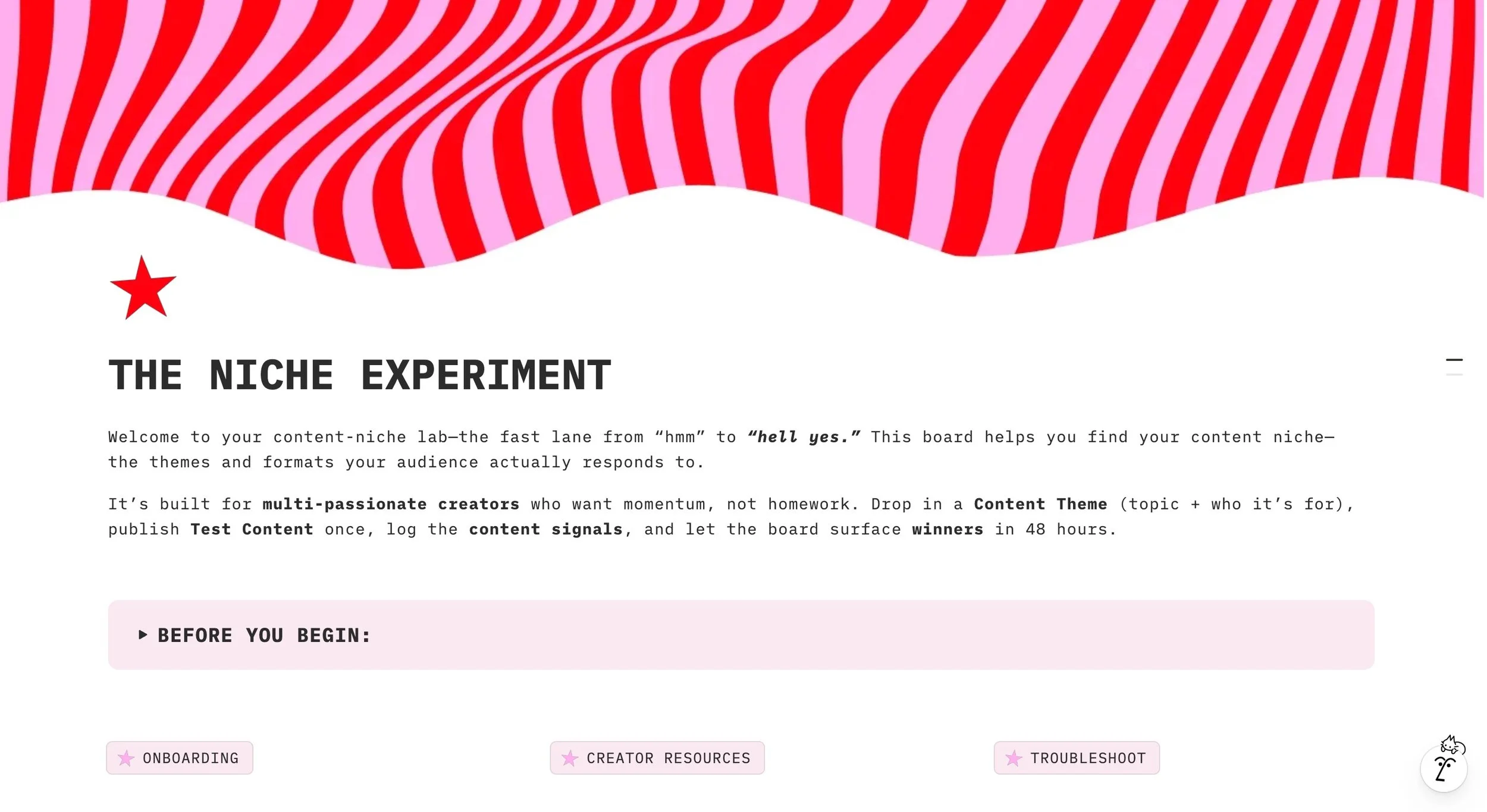
We are clearly lovers of pink and red, so we try to stick to that theme! This is our new baby, “The Niche Experiment” Notion template, and it’s making it’s way to the Notion marketplace super soon.
Pro tip: grab a palette from something you already use—your website, your email header, a Pinterest pin. Keep it in a little color legend at the top of your Notion (just a callout with colored text) so you remember what to use.
3. Treat Cover Images Like Hero Sections
That big banner at the top of every page? That’s your hero image. Don’t waste it.
Make your own in Canva at ~1600px wide. Add your brand colors, maybe a title, maybe an editorial photo, maybe a pattern. Then use those same covers across multiple pages so it looks like one system. When you turn on “page cover” in gallery view, all those pages become pretty cards. That’s how you get that Pinterest-y Notion look people drool over.
Bonus: make different covers for different sections—content, clients, personal, learning—but in the same style so the whole thing still feels unified.
4. Give Every Page an Icon and Standardize It
Icons are tiny but they make the whole workspace feel finished.
Rules to live by:
every page gets an icon
all icons are the same style (all emojis, all minimal, or all custom PNGs)
icons match the color story
For a playful dashboard: 🌸 ✨ 📓 🪩
For a professional dashboard: minimalist line icons or all native Notion icons.
This is also a navigation trick—your brain will start finding pages based on the icon shape/color before reading the title.
5. Use Typography Like A Designer
Yes, Notion only gives you three font options (Guess which one is my favorite? Okay, you got me, it’s “Mono”). No, you don’t have to accept mediocrity.
Pick one font for most pages (totally going for Mono) and then style your headers:
H1 for page title
H2 for main sections
H3 for small sub-sections
occasional ALL CAPS for emphasis
occasional spaced-out letters for editorial drama
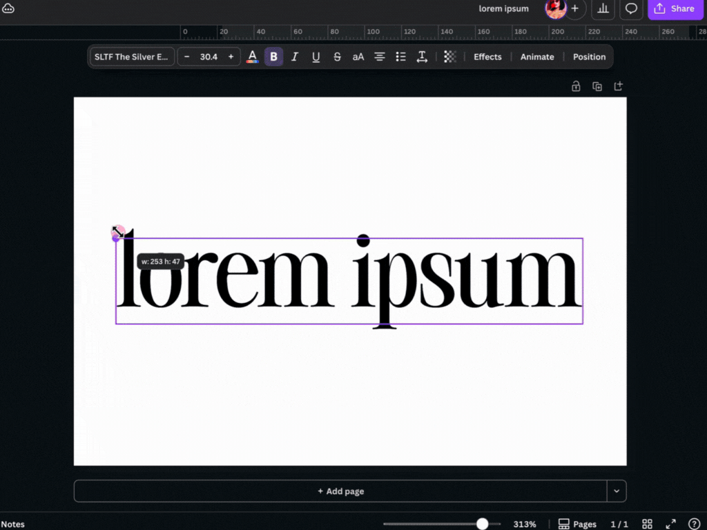
My BEST kept secret: If you want real brand fonts, make the header in Canva and drop it in as an image. People sleep on this, but it’s the fastest way to make Notion look like your site.
6. Callout Blocks = Visual Containers
Callouts are how you fake “cards” in Notion.
Drop a callout, change the background to one of your colors, remove the emoji if you want it cleaner, and then drag other blocks inside it (text, images, links, buttons). Now you’ve got a little dashboard block.
Use callouts for:
Today / Weekly Focus
Quick Links
Affirmation / quote
Content to film this week
“In progress” notes
When you repeat the same callout style across the page, the whole layout starts looking designed, not typed.
7. Build with Columns Like You’re Laying Out a Magazine
Single-column pages read like notes. Multi-column pages read like systems.
Try this layout on the main dashboard:
left column: tasks, quick links, priorities
middle/wide column: main database (content, projects, clients)
right column: image, clock widget, quote, inspo
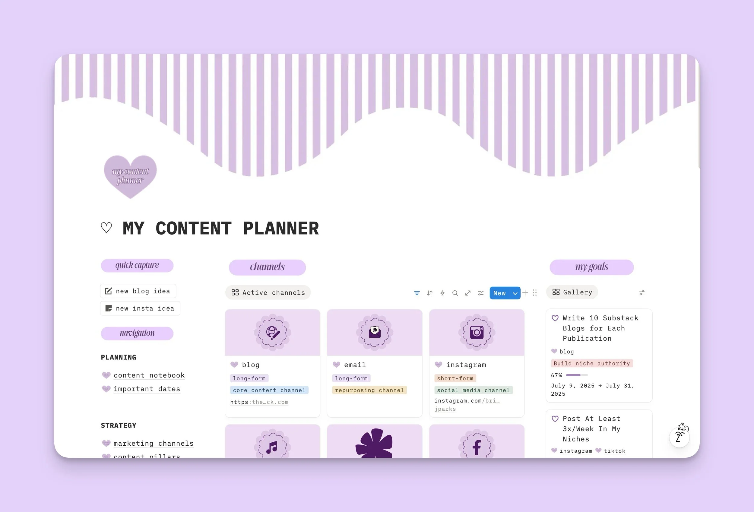
I went crazy with the columns and layout with this one in order to teach myself the ropes. Not bad, if I do say so myself! I was definitely in spacing hell for a bit though.
You can even do three columns, shrink the outer two, and make a wide center strip for your main stuff. That little change alone makes your dashboard look premium. Just remember: mobile will stack it, so keep the most important stuff at the top.
8. Make Databases Visual (Gallery/Board Views)
A list of pages? Snooze.
A gallery of pages with custom covers? Gorgeous.
Any database that’s “resources,” “content ideas,” “products,” “pages,” “client libraries”—turn it into a gallery view and set the card preview to Page Cover. Now every item is a card.
You can also:
hide extra properties to keep cards clean
make your own covers so the grid looks branded
use board view with colored columns for kanban-style layouts
This is where your dashboard starts to feel like a digital playground instead of a document.
9. Add Widgets… Strategically
You do not need 15 widgets!
Pick one or two that make sense for that page:
a clock on your daily
a countdown on your launch dashboard
a quote on your creative space
a Spotify embed in your studio page
Set the widget colors to something close to your palette so it doesn’t scream “I copied a widget from somewhere else.” Widgets should support the aesthetic, not hijack it. Want just a few widgets, though? That’s okay. Check out these incredible websites below that have quite an extensive selection of them.
10. Use Visual Indicators for Progress
Notion lets you change number properties into bars and rings—use that.
If you’re tracking:
content published
client projects
habits
monthly goals
…display those as progress bars. It makes the dashboard feel alive and makes you want to open it. You can also drop little emojis at the start of lines (⭐ Priority, 🧠 Brain dump, 🗓️ This week) to visually break up sections.
Small visual differences = easier scanning.
11. Upgrade Your Bullet Points
Default bullets don’t exactly scream “designer.”
For static lists (not to-dos), type your own bullets:
✨
💗
→
•
Then write your list. This is especially cute for “what’s inside,” “today’s power list,” “quick links,” or “reminders to self.” Don’t do this for long lists you edit daily—it’s manual—but for hero sections, it looks intentional.
12. Drop in Images and GIFs for Personality
Your dashboard doesn’t have to be all text. Add visual breaks.
Ideas:
a small aesthetic photo under the title
a screenshot of your brand board
a tiny looping GIF inside a callout (reward yourself on your daily page)
your actual product mockups in your business dashboard
Just make sure everything matches your direction. If your whole dashboard is minimal pink and red, don’t drop in a neon green anime gif. We are tasteful here.
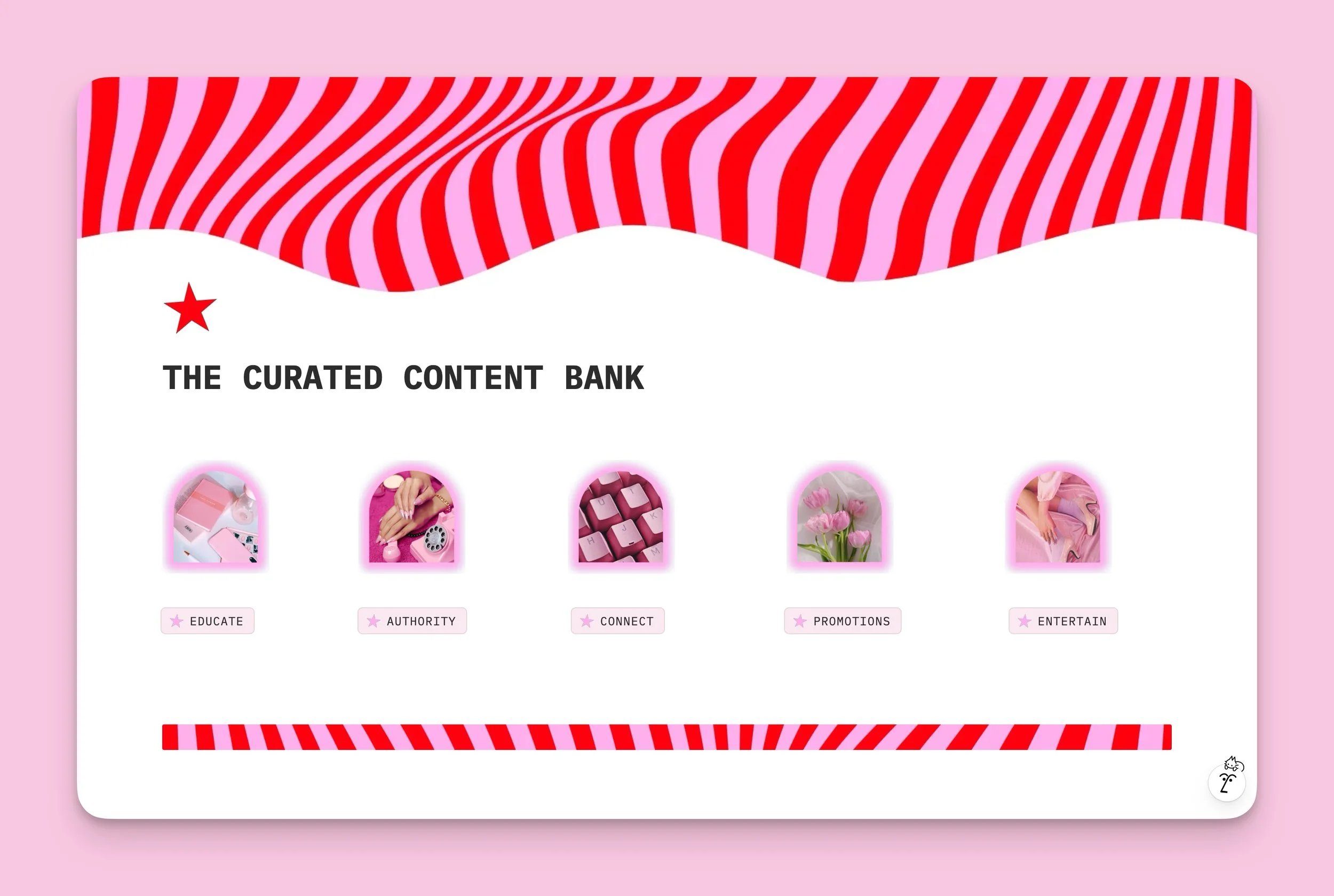
Take frames from Canva and pop in your favorite aesthetic images, then upload them into Notion, add some buttons or toggles and fidget with the spacing for a while, then viola! You have yourself a pretty fancy themed Notion dashboard.
13. Respect White Space
This is where people ruin it.
White space = breathing room. When every inch of your Notion page is filled with widgets, databases, quotes, and whatever else you dragged in, your brain reads it as “work.” When there’s space around sections, it reads it as “designed.” And that matters, because in UX there’s a thing called the aesthetic–usability effect — people are more likely to think something works better when it looks better. So if your dashboard looks clean, your brain decides it’s easier to use… and then it actually is easier to use.
Practically, that means: group related blocks together, then give them space. Use dividers to separate sections. Don’t stack five callouts back-to-back with no margin. Tuck non-urgent stuff into toggles so it’s there, but not yelling at you. Let your layout breathe.
A clean dashboard invites you in and makes navigation feel obvious. A crowded one makes you scroll, get annoyed, and open Instagram instead.
14. Hide the Clutter with Toggles
You’re allowed to have a lot of info—you just don’t have to show it.
Make a toggle called:
“Resources”
“Sometime later”
“Old projects”
“Archived launches”
…and dump all the extra links in there. On the surface: clean, aesthetic, curated. Underneath: everything you need. It’s the desktop drawer of Notion.
You can even put columns inside toggles if you want to get fancy.
Hey you, want a free template while you’re here?
Smash the button below to get our Creative Ideas Vault 2.0, a starry-skied aesthetic brain dump and creative idea organizer, on the house!
15. Match Everything, Everywhere
This is the final boss.
Aesthetic = consistency. If one page is pink with serif headers and custom covers, every main page should be pink with serif headers and custom covers. If you use emojis in headers, use them everywhere. If your covers are all rounded, keep them rounded.
Make yourself a mini “Notion style standards” block at the top of your main page:
colors: #ff000f, #ff97f2, black, white
font: Mono
icons: custom
callouts: pink + white
covers: Canva, 1600px, red/pink editorial
Then follow it. That’s how it starts to look like a brand.
Bottom line: an aesthetic Notion dashboard isn’t about throwing cute stuff at the page. It’s about designing it like you would a landing page—layout, hierarchy, color, imagery, spacing—just inside Notion. Do that, and suddenly your workspace isn’t just where you plan content.
It’s part of your brand.